Set a Chart Axis Introduction You can create various types of charts such as column charts, line charts, waterfall charts, etc. Each of them has its axes that help interpret the data. The horizontal axis typically displays categories or time periods. The Vertical axis displays data values or numerical indicators. Some charts may have a third axis, for instance, to display additional information or compare data. Use the following method to customize the axes, add labels, adjust scales, and apply other settings.
SetChartAxis
API Type Description Resource
/slides/{name}/slides/{slideIndex}/shapes/{shapeIndex}/{axisType}
PUT
Updates the chart axis properties in a presentation saved in a storage.
SetChartAxis
Request Parameters
Name Type Location Required Description
name
string
path
true
The name of a presentation file.
slideIndex
integer
path
true
The 1-based index of a slide.
shapeIndex
integer
path
true
The 1-based index of a shape (must be a chart).
axisType
AxisTypepath
true
The type of an axis.
axis
Axisbody
true
The data transfer object with the axis parameters.
password
string
header
false
The password to open the presentation.
folder
string
query
false
The path to the folder containing the presentation file.
storage
string
query
false
The name of the storage contaning the folder.
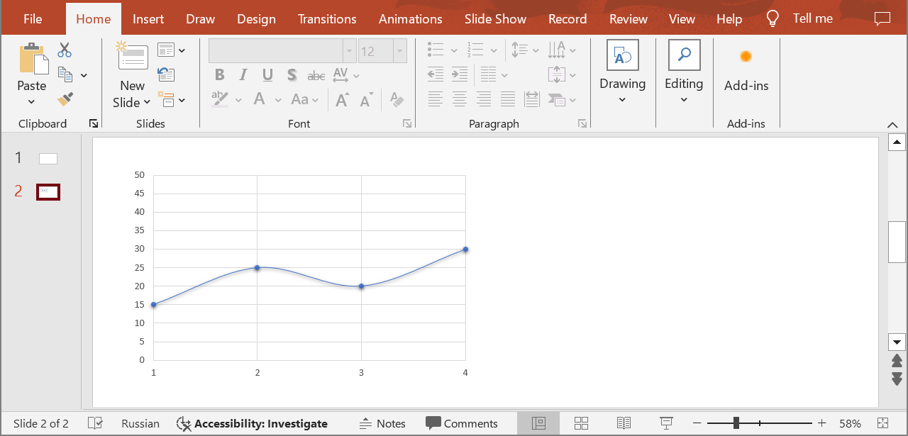
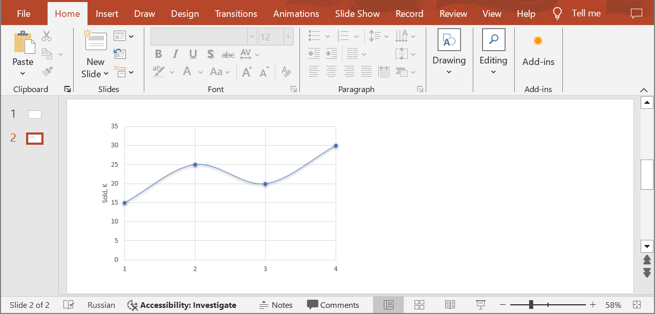
Examples The document MyPresentation.pptx saved in the default storage contains a chart (the first shape) on the second slide that displays the number of items sold for quarters 1 through 4. Apply the following settings for the vertical axis:
show the axis title
set the maximum value to 35
cURL Solution
Request
Get an Access Token
curl POST "https://api.aspose.cloud/connect/token" \
"grant_type=client_credentials&client_id=MyClientId&client_secret=MyClientSecret" \
"Content-Type: application/x-www-form-urlencoded"
Update the Vertical Axis
curl -X PUT "https://api.aspose.cloud/v3.0/slides/MyPresentation.pptx/slides/2/shapes/1/VerticalAxis" \
"authorization: Bearer MyAccessToken" \
"Content-Type: application/json" \
VerticalAxis.json
{
"HasTitle" : true ,
"IsAutomaticMaxValue" : false ,
"MaxValue" : 35
}
Response
Response Example
{
"hasTitle" : true ,
"position" : "Left" ,
"majorTickMark" : "None" ,
"isAutomaticMaxValue" : false ,
"maxValue" : 35 ,
"axisBetweenCategories" : false ,
"tickLabelRotationAngle" : -1000 ,
"fillFormat" : {
"type" : "NoFill"
},
"lineFormat" : {
"fillFormat" : {
"type" : "NoFill"
}
},
"majorGridLinesFormat" : {
"lineFormat" : {
"alignment" : "Center" ,
"capStyle" : "Flat" ,
"joinStyle" : "Round" ,
"style" : "Single" ,
"fillFormat" : {
"type" : "Solid" ,
"color" : "#FFD9D9D9"
},
"width" : 0.75
}
},
"minorGridLinesFormat" : {
"lineFormat" : {
"fillFormat" : {
"type" : "NoFill"
}
}
}
}
SDK Solutions
C#
using System ;
using Aspose.Slides.Cloud.Sdk ;
using Aspose.Slides.Cloud.Sdk.Model ;
class Application
{
static void Main ( string [] args )
{
SlidesApi slidesApi = new SlidesApi ( "MyClientId" , "MyClientSecret" );
string fileName = "MyPresentation.pptx" ;
int slideIndex = 2 ;
int shapeIndex = 1 ;
AxisType axisType = AxisType . VerticalAxis ;
Axis axis = new Axis
{
HasTitle = true ,
IsAutomaticMaxValue = false ,
MaxValue = 35
};
Axis updatedAxis = slidesApi . SetChartAxis ( fileName , slideIndex , shapeIndex , axisType , axis );
Console . WriteLine ( "Axis has the title: " + updatedAxis . HasTitle ); // True
Console . WriteLine ( "Maximum value: " + updatedAxis . MaxValue ); // 35
}
}
Java
import com.aspose.slides.ApiException ;
import com.aspose.slides.api.SlidesApi ;
import com.aspose.slides.model.Axis ;
import com.aspose.slides.model.AxisType ;
public class Application {
public static void main ( String [] args ) throws ApiException {
SlidesApi slidesApi = new SlidesApi ( "MyClientId" , "MyClientSecret" );
String fileName = "MyPresentation.pptx" ;
int slideIndex = 2 ;
int shapeIndex = 1 ;
AxisType axisType = AxisType . VERTICALAXIS ;
Axis axis = new Axis ();
axis . setHasTitle ( true );
axis . setIsAutomaticMaxValue ( false );
axis . setMaxValue ( 35d );
Axis updatedAxis = slidesApi . setChartAxis ( fileName , slideIndex , shapeIndex , axisType , axis , null , null , null );
System . out . println ( "Axis has the title: " + updatedAxis . isHasTitle ()); // true
System . out . println ( "Maximum value: " + updatedAxis . getMaxValue ()); // 35
}
}
PHP
use Aspose\Slides\Cloud\Sdk\Api\Configuration ;
use Aspose\Slides\Cloud\Sdk\Api\SlidesApi ;
use Aspose\Slides\Cloud\Sdk\Model\AxisType ;
use Aspose\Slides\Cloud\Sdk\Model\Axis ;
$configuration = new Configuration ();
$configuration -> setAppSid ( "MyClientId" );
$configuration -> setAppKey ( "MyClientSecret" );
$slidesApi = new SlidesApi ( null , $configuration );
$fileName = "MyPresentation.pptx" ;
$slideIndex = 2 ;
$shapeIndex = 1 ;
$axisType = AxisType :: VERTICAL_AXIS ;
$axis = new Axis ();
$axis -> setHasTitle ( true );
$axis -> setIsAutomaticMaxValue ( false );
$axis -> setMaxValue ( 35 );
$updatedAxis = $slidesApi -> setChartAxis ( $fileName , $slideIndex , $shapeIndex , $axisType , $axis );
echo "Axis has the title: " , $updatedAxis -> getHasTitle (), " \n " ; // 1
echo "Maximum value: " , $updatedAxis -> getMaxValue (); // 35
Ruby
require "aspose_slides_cloud"
include AsposeSlidesCloud
configuration = Configuration . new
configuration . app_sid = "MyClientId"
configuration . app_key = "MyClientSecret"
slides_api = SlidesApi . new ( configuration )
file_name = "MyPresentation.pptx"
slide_index = 2
shape_index = 1
axis_type = AxisType :: VERTICAL_AXIS
axis = Axis . new
axis . has_title = true
axis . is_automatic_max_value = false
axis . max_value = 35
updated_axis = slides_api . set_chart_axis ( file_name , slide_index , shape_index , axis_type , axis )
puts "Axis has the title: #{ updated_axis . has_title } " # true
puts "Maximum value: #{ updated_axis . max_value } " # 35
Python
from asposeslidescloud.apis import SlidesApi
from asposeslidescloud.models import AxisType
from asposeslidescloud.models import Axis
slides_api = SlidesApi ( None , "MyClientId" , "MyClientSecret" )
file_name = "MyPresentation.pptx"
slide_index = 2
shape_index = 1
axis_type = AxisType . VERTICALAXIS
axis = Axis ()
axis . has_title = True
axis . is_automatic_max_value = False
axis . max_value = 35
updated_axis = slides_api . set_chart_axis ( file_name , slide_index , shape_index , axis_type , axis )
print ( "Axis has the title:" , updated_axis . has_title ) # True
print ( "Maximum value:" , updated_axis . max_value ) # 35
Node.js
const cloudSdk = require ( "asposeslidescloud" );
const slidesApi = new cloudSdk . SlidesApi ( "MyClientId" , "MyClientSecret" );
fileName = "MyPresentation.pptx" ;
slideIndex = 2 ;
shapeIndex = 1 ;
axisType = cloudSdk . AxisType . VerticalAxis ;
axis = new cloudSdk . Axis ();
axis . hasTitle = true ;
axis . isAutomaticMaxValue = false ;
axis . maxValue = 35 ;
slidesApi . setChartAxis ( fileName , slideIndex , shapeIndex , axisType , axis ). then ( updatedAxis => {
console . log ( "Axis has the title:" , updatedAxis . body . hasTitle ); // true
console . log ( "Maximum value:" , updatedAxis . body . maxValue ); // 35
});
C++
#include "asposeslidescloud/api/SlidesApi.h"
using namespace asposeslidescloud :: api ;
int main ()
{
std :: shared_ptr < SlidesApi > slidesApi = std :: make_shared < SlidesApi > ( L "MyClientId" , L "MyClientSecret" );
const wchar_t * fileName = L "MyPresentation.pptx" ;
int slideIndex = 2 ;
int shapeIndex = 1 ;
const wchar_t * axisType = L "VerticalAxis" ;
std :: shared_ptr < Axis > axis = std :: make_shared < Axis > ();
axis -> setHasTitle ( true );
axis -> setIsAutomaticMaxValue ( false );
axis -> setMaxValue ( 35 );
std :: shared_ptr < Axis > updatedAxis = slidesApi -> setChartAxis ( fileName , slideIndex , shapeIndex , axisType , axis ). get ();
std :: wcout << L "Axis has the title: " << updatedAxis -> isHasTitle () << " \r\n " ; // 1
std :: wcout << L "Maximum value: " << updatedAxis -> getMaxValue (); // 35
}
Perl
use AsposeSlidesCloud::Configuration ;
use AsposeSlidesCloud::SlidesApi ;
use AsposeSlidesCloud::Object::Axis ;
my $configuration = AsposeSlidesCloud::Configuration -> new ();
$configuration -> { app_sid } = "MyClientId" ;
$configuration -> { app_key } = "MyClientSecret" ;
my $slides_api = AsposeSlidesCloud::SlidesApi -> new ( config => $configuration );
my $file_name = "MyPresentation.pptx" ;
my $slide_index = 2 ;
my $shape_index = 1 ;
my $axis_type = "VerticalAxis" ;
my $axis = AsposeSlidesCloud::Object::Axis -> new ();
$axis -> { has_title } = "True" ;
$axis -> { is_automatic_max_value } = "False" ;
$axis -> { max_value } = 35 ;
my $updated_axis = $slides_api -> set_chart_axis (
name => $file_name , slide_index => $slide_index , shape_index => $shape_index , axis_type => $axis_type , axis => $axis );
print ( "Axis has the title: " , $updated_axis -> { has_title }, "\n" ); # 1
print ( "Maximum value: " , $updated_axis -> { max_value }); # 35
Swift
Go
import (
"fmt"
asposeslidescloud "github.com/aspose-slides-cloud/Aspose.Slides-Cloud-SDK-for-Go/v24"
)
func main () {
configuration := asposeslidescloud . NewConfiguration ()
configuration . AppSid = "MyClientId"
configuration . AppKey = "MyClientSecret"
slidesApi := asposeslidescloud . NewAPIClient ( configuration ). SlidesApi
fileName := "MyPresentation.pptx"
var slideIndex int32 = 2
var shapeIndex int32 = 1
axisType := string ( asposeslidescloud . AxisType_VerticalAxis )
axis := asposeslidescloud . NewAxis ()
axis . HasTitle = true
axis . IsAutomaticMaxValue = false
axis . MaxValue = 35
updatedAxis , _ , _ := slidesApi . SetChartAxis ( fileName , slideIndex , shapeIndex , axisType , axis , "" , "" , "" )
fmt . Println ( "Axis has the title:" , updatedAxis . GetHasTitle ()) // true
fmt . Println ( "Maximum value:" , updatedAxis . GetMaxValue ()) // 35
}
The result:
SDKs Check Available SDKs to learn how to add an SDK to your project.