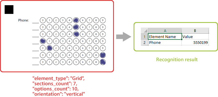
Grid
This element generates a block consisting of numbered bubbles. The block is recognized as a whole, resulting in all marked bubbles forming a single answer.
Grid element is an OMR-specific approach to collecting simple numeric data such as a TIN or phone number, or getting an answer to a math test without using optical character recognition (OCR).
Declaration
This element is declared as an object with "element_type": "Grid" property.
The maximum number of digits in the combined response is specified in the sections_count property.
The number of bubbles for each digit is specified in the options_count property.
{
	"element_type": "Grid",
	"sections_count": 7,
	"options_count": 10
}
Required properties
| Name | Type | Description |
|---|---|---|
| element_type | string | Must be "Grid" (case-insensitive). |
| sections_count | integer | The maximum number of digits in the combined response. Each digit is represented as a line or column of bubbles, depending on the element’s orientation property. |
| options_count | integer | The number of bubbles for each digit. |
Optional properties
| Name | Type | Default value | Description |
|---|---|---|---|
| name | string | n/a | Used as an element’s identifier in recognition results and is displayed as a label on the form. |
| align | string | “left” | Horizontal alignment of Grid element: "left", "center" or "right". |
| orientation | string | “horizontal” | Element’s orientation:
|
| header_type | string | “underline” | The type of the box to be displayed in front of each column / row. This box can be used for hand-writing the answer in addition to marking bubbles.
|
| header_border_size | integer | 3 | Border width of the box to be displayed in front of each column / row. |
| header_border_color | string | “black” | Border color of the box to be displayed in front of each column / row. Can be picked from one of the supported values. |
| vertical_margin | integer | 0 | Vertical spacing between the element’s lines, in pixels. |
| bubble_size | string | “normal” | Size of bubbles: "extrasmall", "small", "normal", "large", or "extralarge". |
| bubble_type | string | “round” | Bubble style: "round" or "square". |
| x | integer | n/a | Set the absolute position of the Grid element relative to the left edge of the page. Overrides the value of align property. |
| y | integer | n/a | Set the absolute position of the Grid element relative to the top edge of the page. |
| column | integer | 1 | The number of the column where the Grid element will be placed. Only applicable if Grid is placed in a multi-column Container element. |
Recognition behavior
Numbers from each marked bubble are merged into a single number.
If several bubbles are marked in one row / column, they are also merged into a number with multiple digits. For example, if the respondent marks bubbles “3” and “7” in one row and “5” in another, the recognition result for the grid element will be “375”.
If this behavior is undesirable, instruct respondents to select one bubble per row / column (depending on the orientation property) or use CompositeGrid element.
Allowed child elements
None.
Examples
Check out the code examples to see how grid elements can be used.
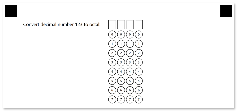
Horizontal grid
{
	"element_type": "Template",
	"children": [
		{
			"element_type": "Page",
			"children": [
				{
					"element_type": "Grid",
					"name": "Convert decimal number 123 to octal",
					"sections_count": 4,
					"options_count": 8,
					"bubble_size": "large",
					"header_type": "square"
				}
			]
		}
	]
}
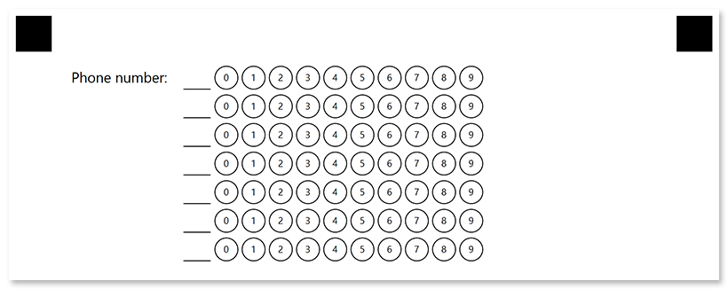
Vertical grid
{
	"element_type": "Template",
	"children": [
		{
			"element_type": "Page",
			"children": [
				{
					"element_type": "Grid",
					"name": "Phone number",
					"sections_count": 7,
					"options_count": 10,
					"bubble_size": "large",
					"orientation": "vertical"
				}
			]
		}
	]
}